New Menu for a Mobile App - Millennium BCP
Role
UX/UI Designer
Company
Responsibilities
Millennium BCP
UX Research, User Interview,
Design, Usability test.
Timeline Work
2021 - 2022
Context
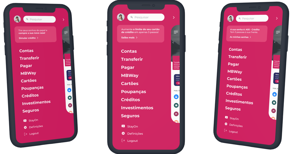
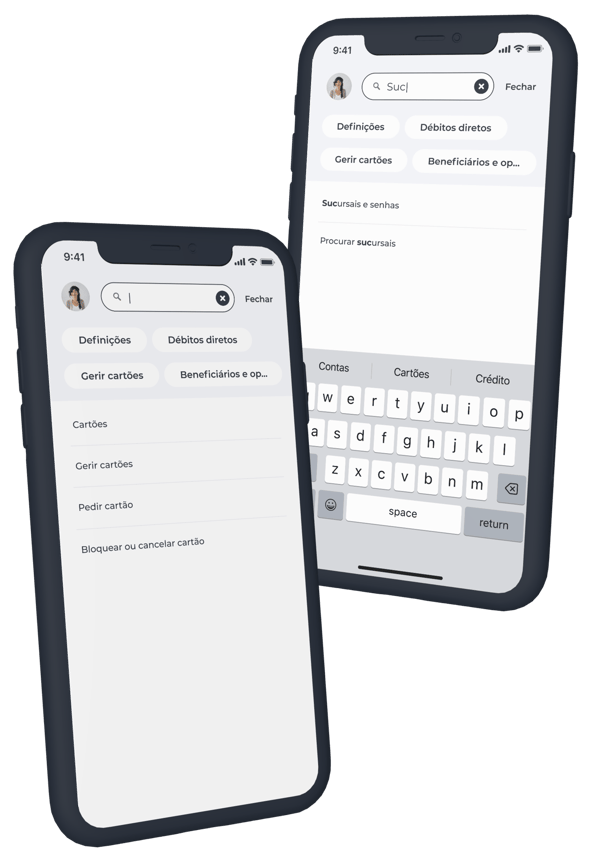
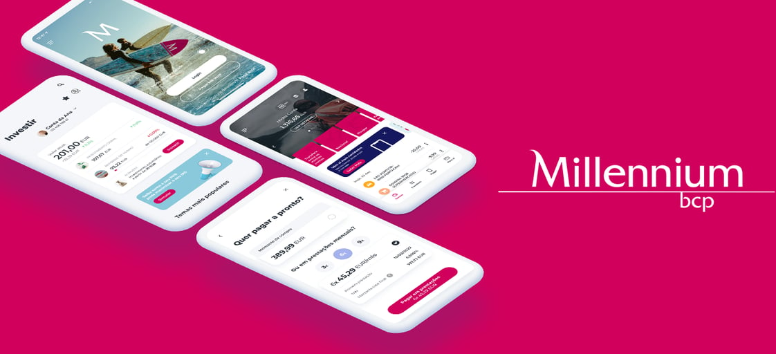
This is a feature of a new menu for the banking application of the largest private bank in Portugal (Millennium BCP). The purpose of this functionality was to improve usability and promote business improvements for other bank products within the application. The main challenge, in this case, was to promote a design that had good usability and that could be implemented according to the limitations of the programming language used for the development of the mobile application.
Problem
Because it was a feature requested by some stakeholders, the main goal was to identify which problem they would like to solve first. After some interviews with some of them, we identified that the main phrase said was: "Our customers are unable to find some features within our App and we want to help them find it in a simpler, easier, and more objective way!".
Interview stakeholders and understand the real needs for the new feature to exist
Desk research: collect and analyse the data that we already have regarding this problem.
Interview users to identify other problems and create new opportunities for the feature.
And finally, cross-check quantitative and qualitative data to provide an accessible solution based on the needs of the product, stakeholders and users.
Research & Data Analysis
After the stakeholder's interview, our team decided to start putting hands-on desk research. The main goal was to identify the problems related to the findability and usability of the home page application.
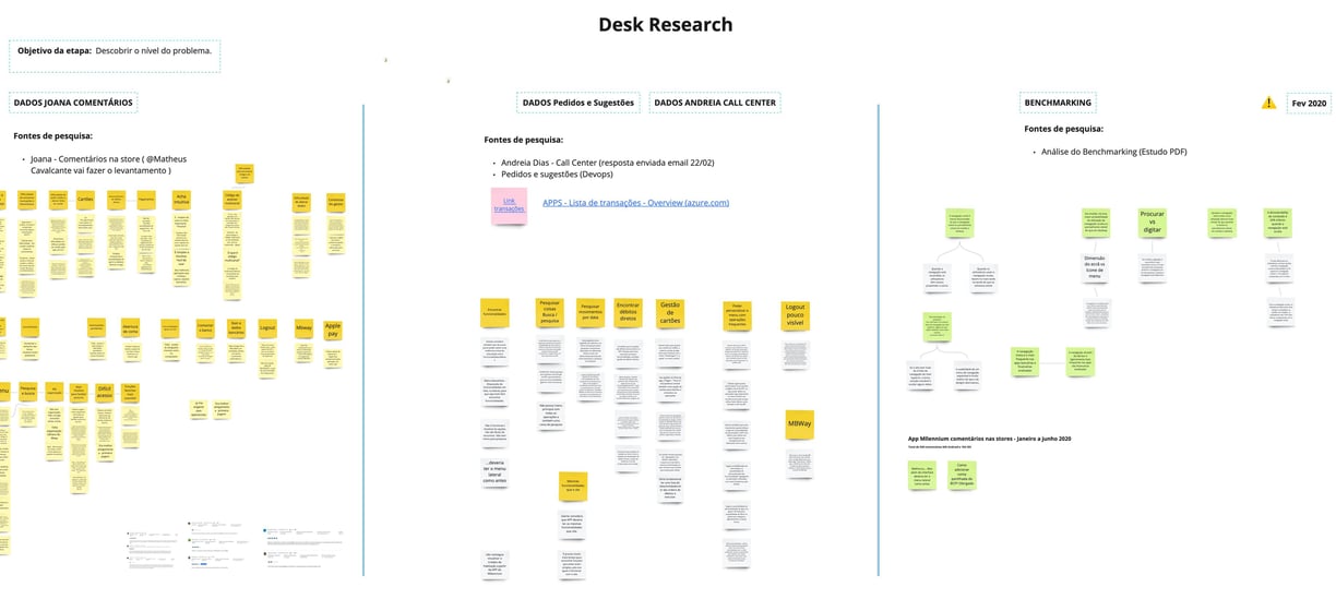
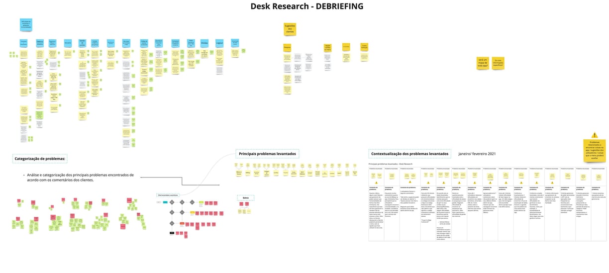
For this, we read 500+ customer comments related to problems with searching features in the App. We collected and analysed comments from the App's feedback dashboard, from the Stores (Google and Apple stores), and through comments extracted by the company's Contact Center and Support.
The whole data collected was organised and categorised through an online-based tool, which everyone from the team could have access to at any time.
User Interview
After analysing the data, we identified some complaint patterns related to 13 different topics from the Application. Based on that, we decided with the stakeholders on the most serious ones for the business. After that, we decided to talk with the customers to carry out a usability test with them.
The test was done with the current application (without the future solution). The idea was to understand more deeply what are the real needs of the users and whether the problems identified through the desk research were real.
Main problems identified in the identifications and tests:
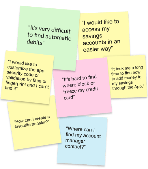
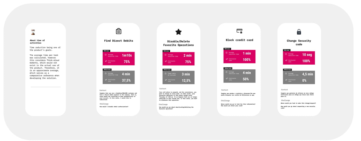
Half of the customers interviewed had huge difficulty blocking a credit card through the application.
None of the interviewed customers was able to complete the task of requesting a new security code or editing the security code provided by the bank to make transfers and payments through the App.
Almost none of them were able to find the functionality to manage their favourite transfers and payments within the application.
Last but not least, we identified that the management of scheduled debts was difficult for users to find since just 12,5% got to conclude the task.
Card Sorting
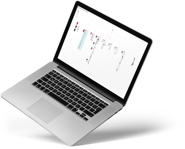
With the strategies defined and aligned with the entire team, we held several card sorting workshops with customers, non-customers, employees, and stakeholders with the intention of reaching the best information architecture structure.
After an entire analysis of the results, we decided to proceed with two architectural proposals and perform A / B testing to find out which one would have the best performance in terms of experience.
Ideation and Prototype
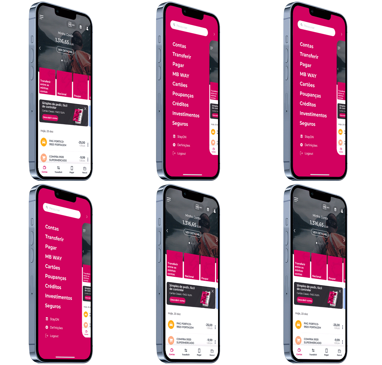

With structured architectures, it was time to move on to the visual part, starting with wireframes develop some visual proposals, to make the findings a little more tangible.
We made some proposals and, together with the stakeholders, we came up with the definition of a proposal to lead to usability tests.
Usability Test
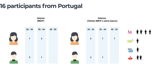
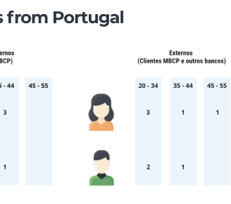
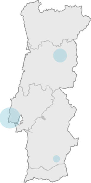
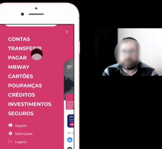
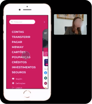
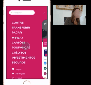
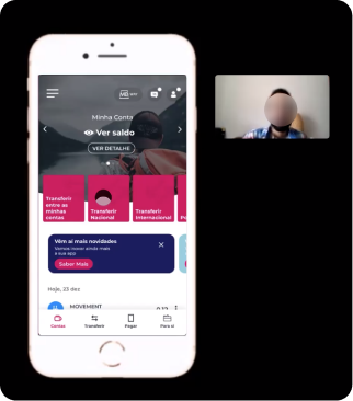
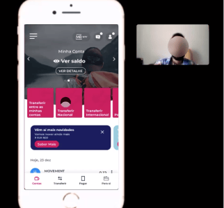
With the visual part structured, it was time to move on to the A / B test. We did tests with 16 people, 8 of them being the same people from the first test and 8 different. We recruited people from different backgrounds and who have bank accounts with other companies.
Results
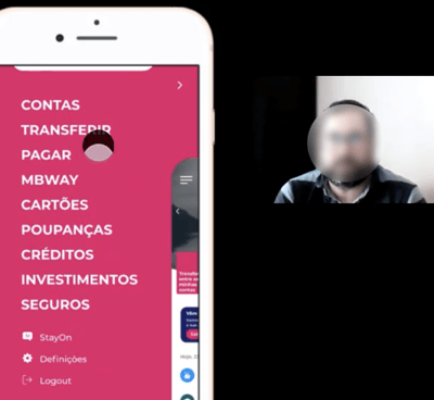
With the new menu, we were able to achieve significant results that pleased both stakeholders and the vast majority of people with whom we tested. With our solution, we were able to raise the findability rates of various features by 75%. In addition, with the new menu, we were able to reduce the user's journey and improve the experience by reducing the search time and improving the usability of the App's form of navigation.
Therefore, we were able to please stakeholders and users of the application with a solution developed based on quantitative and qualitative data. Thus, providing a better experience of using the application.
Visual Design & Prototype
If you have arrived here, please click in the button below to see the prototype created for this use case.


